How we show up.
The standards for presenting the future of brands — a joint event from Aivanta Inc. and acme — across every touchpoint, from stage to screen to inbox.
The lockup
Two parts, always together: the hand-lettered the future of brands script and the Aivanta / acme partner endorsement. Never redraw, re-typeset or separate them.
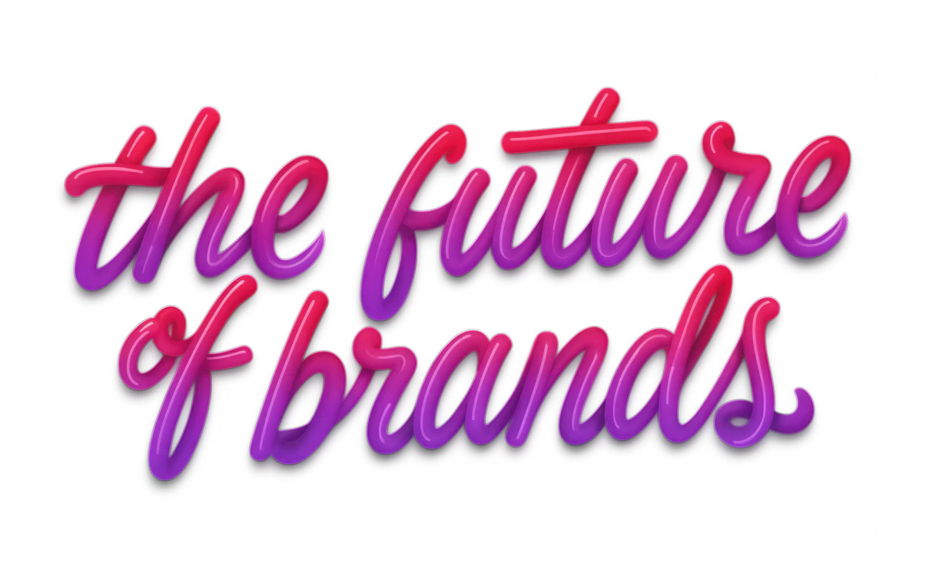
A joint event from Aivanta Inc. and acme
A joint event from Aivanta Inc. and acme
A joint event from Aivanta Inc. and acme
file pending
Clear space
x = height of the “t”A joint event from Aivanta Inc. and acme
Keep a protected zone equal to the height of the “t” in the script on all four sides. No type, imagery or edges may enter it.
Minimum size
width of full lockupA joint event from Aivanta Inc. and acme
A joint event from Aivanta Inc. and acme
Below these sizes the endorsement becomes illegible. Do not use the full lockup below its minimum size.
Don’ts
Partner lockup
Aivanta always leads, followed by a hairline divider and acme. Match the optical heights of both marks. Each partner’s own guidelines govern its mark.
Naming
“the future of brands” is always lowercase. Do not add a prefix or colon to the event name.
Palette
A violet-to-magenta spectrum drawn from the script lettering, charged by a single electric green. Click any code to copy it.
Proportion
Lead with light and deep neutrals. Signal Green is a spark, not a field — reserve it for primary CTAs and live indicators.
Accessible pairings
Never set body text in green on light backgrounds or in hot pink on violet.
Typefaces
Two fonts do almost all the work: Bricolage Grotesque for headlines and Hanken Grotesk for everything you read. JetBrains Mono adds small moments of personality — use it sparingly.
Bricolage Grotesque
Our voice at its loudest. A bold, slightly quirky sans-serif that gives headlines character without shouting. Set it tight — slightly negative letter-spacing — and keep headlines short.
The right people.
Hanken Grotesk
A clean, highly readable workhorse. Anything people actually read — descriptions, bios, emails, navigation — is set in Hanken. Use Semibold to highlight key phrases rather than switching fonts.
JetBrains Mono
A small, technical-looking font for metadata. It sits above headlines as an "eyebrow" label or marks dates, times and section numbers. Usually set in capitals with wide letter-spacing.
03 — TYPOGRAPHY
How they work together
How we sound
Confident, curious and direct. We speak like a smart peer in the room — never a vendor at a booth.